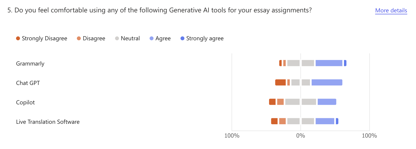
Microsoft forms presents the responses to the survey questions in what itthinks is the best way to display the data.
However, this isn't always the best way to interpret the responses or isn't the best way for our hypothetical
audience (the university).
We experimented with using an array of graphs to exhibit our answers.
When we reached this stage and saw our data in this visual way, we realised we perhaps had not asked
the best questions to fit this format. If we were to conduct the survey again, I would alter the questions to be more binary questions as this is
easier to read in a graph form. Also, I would ask more specific questions to get a better idea of the audience/participants. For
example, we asked if they were international students or not.

This information would allow the university to see if a larger proportion of international students were using AI tools but this wouldn't help them to understand why. Instead, we should have asked the participants to state their home country, this would then help to pinpoint if people who didn't have English as a first language were more likely to use these tools to help their studies.